You have a business already, or you are starting one up – you need an ecommerce website design.
This might be a website on which you sell products, or people can book time with you. Or it might be a semi commerce website, where you present what you sell in an ecommerce environment – with an ‘enquire within’ option instead.
These are the fundamentals. But what makes a really great ecommerce website design? I mean you can go to so many places to get one done – but experience does count. Just throwing one together isn’t always the best option.
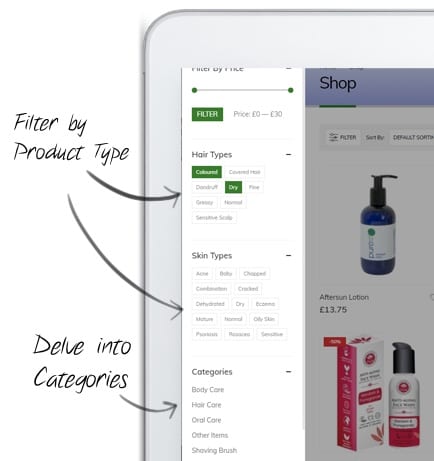 Product Filters
Have a think about what people are looking for when they land on your website. Are they looking for ‘all the jeans you sell’, or a particular brand? Maybe they are looking for Levi jeans, but only black ones? Or perhaps Black ones, in since 32R. These are all things customers want, when they arrive.
Consider this: you go to Ebay looking for a leather jacket. Do they just let you search for Price, or for Buy It Now, UK Seller only, Mens or Ladies… the options go on. But it means you can ‘drill down’ to find your perfect item.
This all sounds terribly expensive, but actually, relatively speaking it isn’t. We have built websites with these filters that have done the follow (across varied sites):
- Skin type
- Colour
- Speed
- Size
- Brand
- Thickness
- Height
- Gender
…we could go on, but let’s not bore you with this too much. You see our point? When you get to a category page, you want information. You want to select a colour of product. For example, we are working on a website now that is for paintings. Even that has options. Perhaps the key colours in the painting, maybe Green is the main one, and you want ‘green’ to show up that painting. Or perhaps you want to see all ‘Landscape’ paintings?
Filters are very important. They give the customer control, and let’s they really find it – rather than pages after page after page…. which brings us onto another thing.
Pagination
We have done a blog about Pagination vs Infinity scroll already. However we will still touch on this very briefly. Websites like Netflix or YouTiube use Infinity or ‘Load more’. You just see more and more and more and more….. No idea how many more. No idea on what page you have landed. And if you saw the product earlier, on what page was it? Is it in your History – nope. No idea.
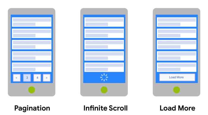 In our view, Infinity scroll as a place – but not on ecommerce websites. Not in our most humble of opinions.
Go to Ebay, Amazon, John Lewis and others. They have Page Numbers. You know where you are. The customer is in control. And you can get to the ‘bottom’ of the page to get help if you need it.
Without that, you never see the bottom of the page, and never know how many more of these blasted products there are.
Our key view here – keep the customer in control. Let them find what they want, and SHARE what they find. Pagination also gives Google a much clearly view on your site’s structure and how many pages you have.
Mobile Usability
There is this thing with Google called ‘Mobile First’, because it now looks at mobile before desktop. This is because more use mobiles for browsing that on PCs. Kind of obvious really, considering how many of us have smartphones. So is yours a responsive website design? A great ecommerce site has focus on mobile – ensuring the ’tiles’ of images are laid out correctly. The menu is easily viewable and clickable.
When you swipe down a category, do you know where you are in the page? Can you tap Page 2, or does it load and load and load (such as the Infinity scroll mentioned earlier). On a mobile device, this can be a real pain. As when you want to go back to the top of the page, you could be ‘flicking’ your finger down for ages!
 Think about your customer
 Think about your customer
If you go to your website, or compare it to others, do you see yours as different, better or worse? A great ecommerce design is one that draws the customer in. They instantly see what you sell, and what you do.
For example, back to the ‘filters’ earlier – when they see a load of products, are they ‘aware’ that they come in colours? No? Well why not? Are you relying on (and hoping) that they just know… or are you going to tell them.
There is a fine balance between ‘info overload’ and giving them what they need to make a judgement decision. If one website says “we have this in blue and red”, and yours says “£55.00 – read more”… and they want red. Where would they go?
But with Info comes Bandwidth. What we mean by this is each element of info on the screen takes time to ‘put on screen’. Too much info, and your site could suffer. Too little, and who will be interested?
A good designer will identify this, and ensure it is the right medium for all concerned.
There is a thing called Google Web Vitals that has been out for a while. It’s basically about the layout and easy of use of a website. It’s something we feel should have been out years ago – after all, that’s mainly what a website is about. This helps to guide you (to a point) on best methods. It won’t however give all the answers. But we often get reviews directly to us on why a customer chose us – usually it’s down to ease of use of our website. Easy to find things. Easy to get hold of us. This is all part of Web Vitals.
Give your customers what they need; what they want; help them find their perfect product or service.
To coin a phrase: Don’t tease. Give it to them.
Leave a Reply
You must belogged in to post a comment.