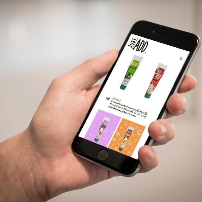
Visual Shop Mobile is a new mobile optimised site for Visual Shop. Fully compliant with all smartphones. Looks great and very easy indeed to navigate.
Update: at the time, Visual Shop only had a desktop website, but we were rolling out Mobile ‘Versions’, which at the time was the thing to be hand. We changed some other websites to have mobile versions, so it was time for our client, Visual Shop to have their website updated.
This meant new code that checked for the device being used, and redirecting the browser to the mobile coded pages, and CSS (stylesheet), so that it viewed beautifully on the mobile device.
Nowadays a site is responsive, so it just altered the design depending on the width of the screen – in 2014, we had to create multi-versions of one website.
More people now browse the web on mobile devices than on desktops so its vital that your website is compatible across all smaller devices. You will be pleased to hear that we’re experts in mobile ready (responsive) web design.
For a Responsive Website, visit our page, or just go to our WordPress Website’s page for details on the latest formats we use.
Leave a Reply
You must belogged in to post a comment.