When we design websites, we pay attention to so many things, one of which is the header area on mobile (and tablet) devices.
Is your website design formatted for phones – properly?
Consider this: more people are browsing websites on phones than on desktop devices. So why would you not have your website designed perfect for these smaller responsive devices? Or why would your designer not pay attention to that?

There are times when you cannot put everything inline, but then you should have it designed so it is spaced correctly, so it looks “finished”.
Perhaps, how a responsive website design should be done?
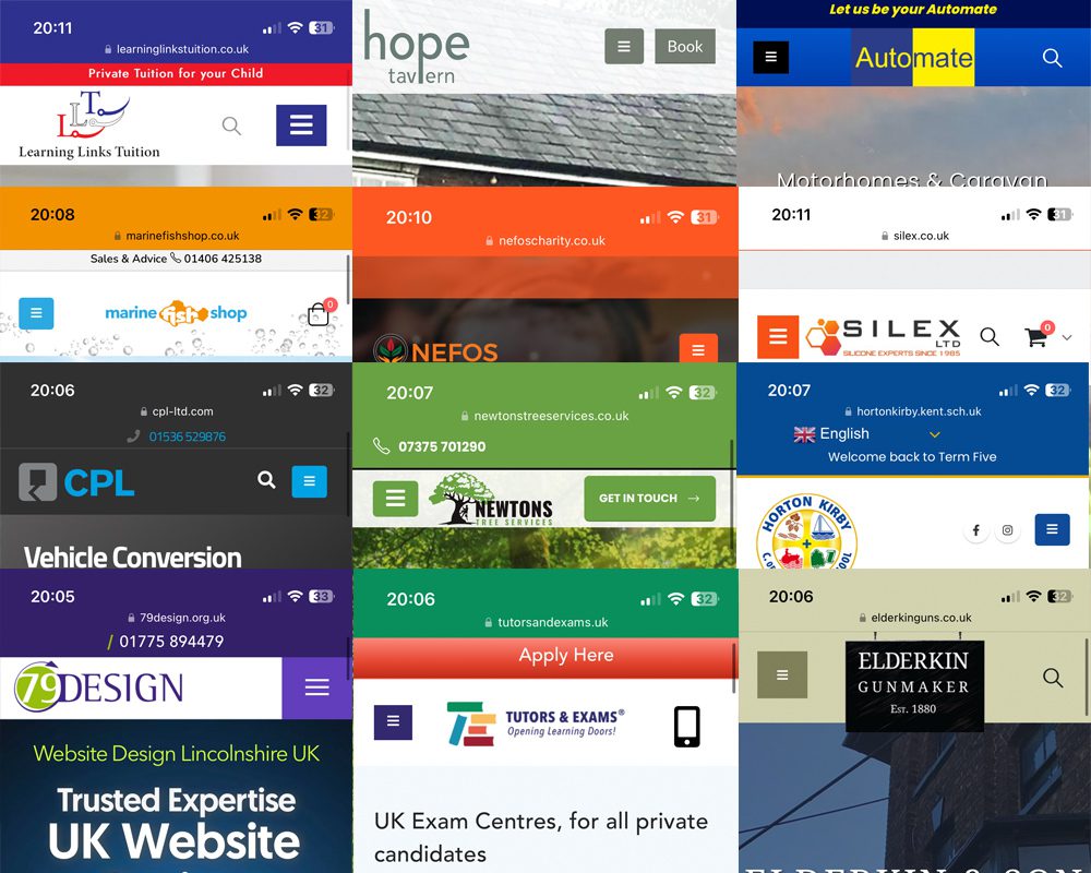
The image shown here is of an array of websites we have designed, demonstrating just their header areas – including our own.
We won’t go through them all, but take a look at these:
Top right: the logo is to the left, with a search inline, and the menu toggle just to the right. And a nice “Slogan” in a red bar at the top.
The second one along has a little “Book” button just next to the menu toggle.
The third one is a different layout altogether – but still perfect on a phone, with the logo in the middle.
Second row, last one has another layout, with the Cart to the right, and search next to it. We had to tweak the sizing to fit it all in.
CPL, third row looks wonderful, almost App-Like with their blue in the background of the menu, and a search just next to it. Plus a tappable phone number at the top.
Third along from CPL is “Horton Kirby”, which has the Social Media next to their menu toggle. Again, it’s all in one line.
They all differ in their own way, but in common, they all have layouts that are perfectly suited to mobile devices. A menu toggle (the three lines) on the left, or the right – sometimes in the middle, but rarely. Frankly we enjoyed putting all this together, as it shows the variation in design that is available to us – even with our own website.
Some even have logos on phones that overlap the screen (see the bottom right one for ‘Elderkin’, tho “Horton Kirby” does it too). Some have custom colour set at the top when you scroll down the page, which is advanced but very effective.
We pay close attention to this area, as when you open it on a phone, this is the first thing you see. If buttons are all out of whack, or logos are too small, or positioned really badly, it is careless website design.
Example – look at your website on a phone. Is the logo in line with buttons? Is there just one button and your menu? Or are there two buttons but entirely miss-shaped and out of sync? This is poor design.
At 79DESIGN our priority is to make your website look amazing on all devices. So we check all devices: big screens, tablet landscape and portrait, and mobile. If your website is not “responsive”, Google will not like it! (nor will users)
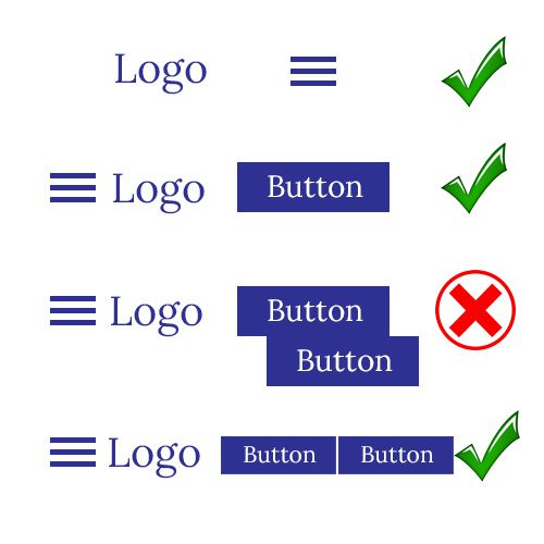
These are a few basic examples of menu layouts on phones. Sometimes they come default, sometimes you can really toy with them and move them – such as the Menu on the right rather than the left. Some WordPress themes allow you to build the header from scratch using Templates. Tho this can sometimes be frought with design issues, if a column wraps under the previous one, and causes issues like you see the ‘X’ version above. We have had this happen, but when testing we found it and changed the format.
Some headers have a very top bar with a phone number or socials. Again, not all WordPress themes have this means, but for those that do, it works beautifully.
So check your website on your phone. Does it look good? Anything covered up? Or is it all accessible and viewable before you even scroll anything? Get critical!
Get in touch with us below, and we will see what we can do.
Leave a Reply
You must belogged in to post a comment.