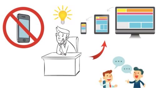
This question is one very much up for debate, as if you compare UK Website Design across the board, some are done really well, some really badly.
A good one, in our view, is where the essential elements shown on desktop, are seen on mobile and portrait tablets, such as the logo, menu, search, and perhaps social media icons. Even the phone number if it’s position can be moved.

But what makes a bad responsive website design?
Responsive, means it responds to the screen’s width, so things collapse, maybe go a little smaller, but still the usability of the website remains wholly intact. So the menu can be tapped on without shifting around the website. Menu items are mostly right there on screen, tho ecommerce tends to need a little swiping to reach the bottom of the menu.
There are rather a large number of blogs articles on this subject, so we shan’t just repeat what others have said, as that would be boring. But our firm belief is that when you load a web page, the vitals should all be there.
If your phone number is key, that should be there. If your logo and menu are (and of course they would be), that should be right there at the top. Golden rule: don’t make people hunt for it.
If you went into a brand new shopping centre, you’d be a bit sick of looking for a map to show where the shops are. Same with a website: don’t make them have to scroll up and down looking for the simplest thing: the menu to the website!
 What about the content itself on a responsive website?
 What about the content itself on a responsive website?
Usually if a web page is split in rows of columns, they naturally collapse down, one column on the other, with the left one first, tho sometimes code allows it to reverse itself. So if you had:
Image : Text
Text : Image
If you left this naturally, you would get:
Image
Text
Text
Image.
If this was in coloured boxes, the Text would join up, so it’s smart to switch them around. For the most part though, this blog article is about responsiveness. Easy of use on smaller devices, and making it as easy to find content as possible – even if it comes to some fancy CSS coding.
Just today one of our school clients asked us if we could hide a row in the header, that had their contact details, as it didn’t look right on a phone. So we hid it, but they also wanted to show the social icons (that the theme was hiding) and centre a Language tool.
So we found the code that hide the icons, and forced them to show. Then overrode the positioning of the Language tool to be in the middle. It’s all down to the width of the screen, not identifying the device (which can be done, but mostly pointless). This all means we can customize the client’s design, while still using an industry standard WordPress theme, that can be updated whenever it needs to be done.
A responsive website isn’t just “yes it contracts on a phone, look….”, it’s about effective design so it is usable, almost App-like it’s design
The means to control layouts, fine tune icons and so much more, comes with such methods.
Want to know more about Responsive Design, visit our Responsive Websites page, or get in touch with us if you have any questions.
Leave a Reply
You must belogged in to post a comment.